Post-PC era, build a responsive web site for mobile visitors
Ready for Responsive Web Layout Design?
Source: http://www.timmy.jp/
Post-PC era
In the past few years, people started to ask for a question about does a PC is still important? Tablet, Smartphone, and Cloud services seems almost covered all needs of digital life nowadays.
I don’t think so. PC usage has been separated into few parts only. More and more front-end operation could be done on mobile devices handily. At the same time, more and more digital resources goes online as Home Network resources and/or Cloud resources. Yes, competing tasks just base on one tool usually, the web browser. I think managing my work stuff, my personal stuff on different kind of devices could got the same result, get the job done on any device which provides common web browsers. Storage space transited from PC hard drives to NAS (Network attached storage), we can access, sharing stuff with family members on Home Network (LAN or WLAN at home), as well as, turn on the internet feature on the NAS device, let yourself, your family members, your friends, your colleague, … . Some people may hired a ultra fast broadband internet connection at home, they may decided to access all of the stuff via Cloud Storage services, such as, Google Drive, Flickr photos, Google Plus Photo, Evernote, … . As a result, the front-end operation not only could be done by PC. Cloud service providers produces specific mobile apps, Responsive web site for web browser on mobile devices serves their user to enjoy anytime, anywhere accessible experience. Of course, thinks have not stick with PC also means that we need to work at anytime, anywhere, sadly result.
Fact behind the so-called Post-PC era
Want to know more the truth of Post-PC era? You may visit a web page, http://www.theverge.com/2015/8/9/9115503/post-pc-is-just-pc.
Does your company web site ready for mobile visitors?
If a online service doesn’t require to make use special feature(such as GPS, Instant notification, Location-based information pushing, instant photo/video taking, etc) that come with a mobile device, no reason to spend money to build a mobile app. Maintaining a app and maintaining a web site means double your online service running cost. A common web site that uses for serving clients/customers should be providing rich features for a long time since the organization decided to put more and more services online. If the web site have been built at or before 2012, almost 100% would not provides Responsive Layout Design. It means the pages might not displayed well enough on mobile devices. Therefore, visitors could not use the online features or surfing information easily. In some worst cases, people could not read any valuable information on the web site that just designed for PC screen. Form filling for any feature usage might become impossible. They need to complete tasks while back to office, or back to home.
Want to experience Responsive Web Layout?
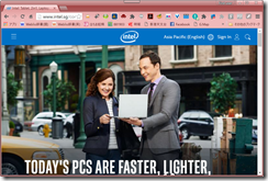
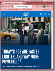
Very easy, you can use your tablet and/or mobile phone to visit this web site (The web site you are currently visiting, yes, www.timmy.jp). When the page loading is finish, try to rotate your device. Then back to your PC, try to visit this web site with any web browser. Try to resize the web browser window. You might experience it serves you with two styles, Large/Small screen size layouts. In some case, Responsive Web Design featured web site may provides three styles, Large/Middle/Small screen size layouts, e.g. www.intel.com . Those web site determine the current screen size to adjust the layout dynamically.
Want to revamp web site?
You can contact my workshop with the following information.


